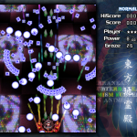
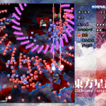
I had the chance recently to sit down with Tim and Hal of Final Form Games, and talk shop on shmups. I mentioned that there were at least a couple of good lessons that I felt I head learned from playing Touhou games, and Hal asked what some of those might be. While I was able to glibly rattle off a nice truism or two, it got me thinking. Just what had I gotten out of trying to deconstruct Touhou? I felt like I’d received a lot of good info from playing it… What things had worked well, and what things hadn’t?
So I started a small list, and was somewhat gratified when it quickly became a moderately large list. Not knowing what else to do with it, I now post it here, since that’s the sort of thing I do with lists that I find interesting and want to share.
Warning, long post ahead! (To keep it from getting [even more] unwieldy, I’m going to restrict this to “shmup-specific lessons”, since it’s lengthy enough as is.)
Here we go!
Errors in the players’ favor make the players feel cool
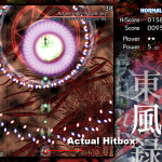
One thing that the developers at CAVE figured out early was what if they made the player’s ship’s hit-box much smaller than the ship itself, then in general, the player felt cooler. The really hard-core players would still figure out exactly where their limits were, but the casual players would occasionally be faced with certain death, only to miraculously survive. As it turns out, people like this feeling! So having the game actively encourage this sort of situation is something of a win.
Errors in the computer’s favor make the player feel cheated
On the reverse side, if the player feels they should have survived/achieved/accomplished something, and instead the computer says “hah hah, turns out you didn’t”, then the player just generally feels angry. If a game, for example, had a hit-box that were larger than the player sprite, this would not go over well.
You want the player to understand your patterns
This is a generalization, but is still true often enough to be worth keeping in mind. If you make a challenge that the player doesn’t understand, and they fail, they just feel frustrated, because their failure is (in their mind) arbitrary. They don’t understand why they failed, so they don’t understand how to not fail. If they fail but understand the challenge, then they know what they need to do to succeed. It might be hard. It still might not be within their abilities. But they’re more likely to try again, because they know what they’re aiming for.
In a shmup, this means making your attack patterns comprehensible. People should be able to tell where things are going, and what their threats are. If they die, it should be because they made a bad choice, not because they couldn’t figure out what was going on. In general, anything you can do to make the patterns more understandable is a good thing.
The board should be understandable at a glance
Shmups often have parts that are very hectic. These are often some of the most fun parts! But because they are so hectic, the player seldom has much time to study the board. They may even be relying on peripheral vision to keep track of large segments of it, while their eyes are glued to their ship, frantically dodging. So anything you can do to make the board easier to read at a glance (while still keeping the frantic pace) is generally a good idea.
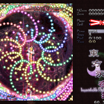
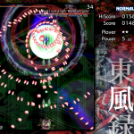
The best way to do this seems to be to vary the look of bullets that do different things. If a bunch of things all fly the same way, from the same source, they should generally look the same. It is still just as frantic, but now the user is better able to understand the board with less time to study it, and can spend more time on dodging frantically (the fun part) and less time on dying because something killed them that they didn’t notice as different. (The less fun part.)
Color matters
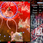
If you take a group of particles that all move the same way, and color them similarly, then players will have an easier time following them. This is important if you expect people to be able to track your patterns well enough to dodge them! Especially since many shmups use a “layered pattern” technique, where there are several different patterns happening at the same time, overlapped. Making each sub-pattern a different color makes them easier for the user to track, which also means that you can get away with harder (and generally prettier) patterns.
Shape matters
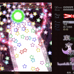
Bullets are also a lot easier to deal with if you can tell their direction at a glance. Circular, omnidirectional bullets are far harder to track than bullets that have a definite direction to them. If the bullets actually change direction mid-flight this becomes vital, but even for straight bullets, (especially if they are in any kind of starburst pattern, radiating out from a central point) it can help tremendously.
Smallest on top!
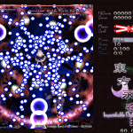
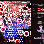
Do you have multiple sizes of bullets? Do they ever overlap? Then you should almost always make sure that you sort them properly. If large bullets can obscure small bullets, there exists a very real chance that the player will try to dodge a large bullet, only to have some tiny bullet come shooting out of the center and kill them, because they couldn’t see it. This frustrates players! Players hate dying to that sort of thing. So while varying bullet sizes is a great way to add variety to patterns, (and make bullets easily differentiable at a glance) make sure that the large bullets can’t actually hide information. (If you have a situation where small bullets are dense enough to hide a large bullet, then the player already has other problems.)
Don’t go overboard with the shakes
Having the screen shake is a great way to add extra “punch” to an effect. Especially if something is blowing up, or hitting something else very hard, or otherwise a significant event that needs emphasis. Do not go overboard! Especially if your game requires precision! A perfect example of both ends of this spectrum exist in Marissa, a character in Imperishable Night. If you select to play as Marissa, you get a giant, screen-obscuring death laser as your bomb. It makes a satisfying droning sound that increases in pitch, and shakes the screen around while you lay waste to everything in front of you. Fun! This is a good use of screen shaking! It emphasizes that this is supposed to be one heck of a laser!
On the other hand, if you don’t play as her, there is a chance that you will have to fight her instead, as the stage 4 boss. While generally a fun boss, she has one especially frustrating attack, in which she uses her giant laser on you. All well and good, except that the screen shaking is still intact. And, as it turns out, trying to dodge a screen full of bullets, requiring careful placement and precision, with the screen shaking wildly for 4-5 seconds at a stretch is… less fun. Frustratingly so.
Good != Bad
Players should really be able to easily differentiate between game elements. If the elements serve the same general purpose, then it’s less important. (People don’t complain as much if they thought they were picking up a powerup, and instead collected a point-up item, for example. Since they wanted it either way.) If the elements are wildly different though, (like say, a powerup vs. a bullet) then you should make sure that there is no chance that the players confuse the two. (People do tend to complain if they tried to pick up what they thought was a powerup, and it killed them.)
Ideally, powerups should be on their own unique group, with no bullets sharing their color. What you don’t want is a situation where the three main colors of bullets in the zone (red, green, and blue) are also the colors that the three types of powerups come in. And even if you run out of colors, you certainly wouldn’t want to have the bullets the same shape as the powerups in that case…
I’m looking at you, Subterranean Animism, stage 4!
Avoid (Good) Spam
So when playing a shmup, the biggest priority for the players is to not die. You die by hitting bullets! So even if there are so many bullets on the screen that they blot out most everything else, that’s generally ok, since anything the bullets might be blotting out is generally of lesser concern to the player than the bullets themselves.
The secondary priority of most shmup players is to collect the good stuff, as long as it’s not going to kill them to try to get it. But since this is less important than not dying, it is a problem if the good things start outnumbering and obscuring the bad things. I didn’t realize how important this one was until I played UFO. (Touhou 12) With even minor enemies releasing a hail of powerups when killed, they frequently obscure the things you care about most, the bullets that you’re trying to avoid colliding with, especially at later levels. (The fact that they are similarly colored does not help matters either…)
That’s all folks!
So there you have it. I tried not to let this list turn into “things that bug me about Touhou games”. I think there are a lot of things they do well, actually. (Pretty much the first two-thirds of the list, really.) But like most things, they’re not perfect, and I think the places they fail are at least as instructive as the places they succeed. But either way, food for thought!
